Alcoa Aluminum (1960)
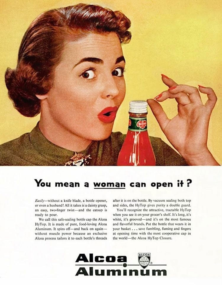
Apparently all it takes is a dainty grasp in order to open up Alcoa Aluminum caps. That’s right! Even women can open up bottles of ketchup thanks to Alcoa.
Alcoa Aluminum
McDonald’s (1965)
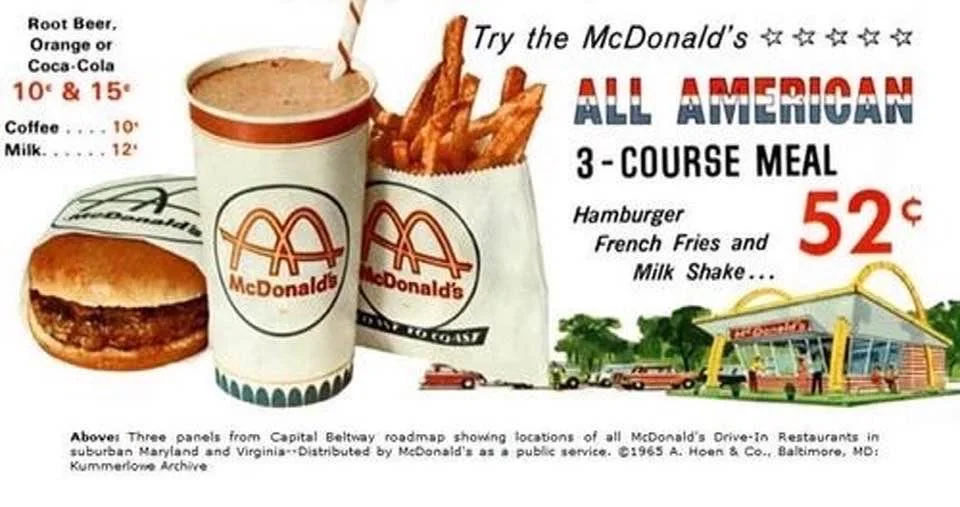
Here’s a 1965 ad for a McDonald’s “All American” three course meal that included a hamburger, fries, and a milkshake, all for 52 cents. You could add in a drink for between 10 to 15 cents. That’s right, a full meal with drink set you back less than one dollar. Even with inflation, that’s a heck of a deal.
McDonald’s (1965)
Tipalet (1960s)
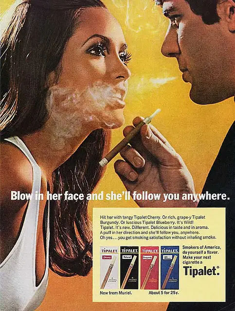
There’s no better way to woo a woman than to blow smelly cigarette smoke in her face, face? This type of advertisement is outdated on two counts: for its misogyny as well as its glorification of smoking cigarettes in the first place. This type of advertisement would never be able to run today.
Tipalet (1960s)
Schlitz Beer (1960s)
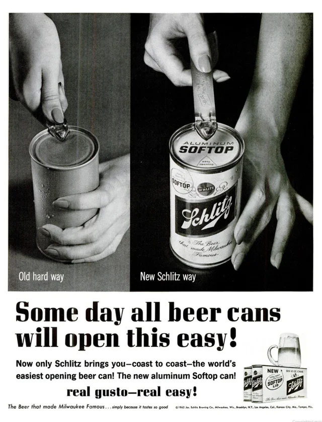
This Schlitz Beer ad from the 1960’s shows us that there was a time where beer cans did not come with a pop tab. Can you imagine having to get out a can opener in order to crack open a nice cold brew? We’re glad that companies have since innovated and made things much easier.
Schlitz Beer (1960s)
Columbia Records (1970s)
No Columbia Records, we actually “can’t believe” this deal of 13 records or tapes for just $1. That’s quite a deal – if you joined the Record & Tape Club, you were guaranteed a great price for your records and tapes, which could truly add up if you got them individually. A lot has changed since those days.
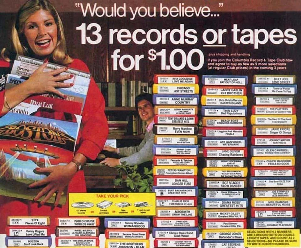
Columbia Records (1970s)
Ohio Carriage Company (1900s)
Although you might not be able to tell immediately from the look of this ad, but The Ohio Carriage Co. was quite ahead of its time. Here they boast that they do not employ children and on top of that, the company was offering a 30 day trial for its Split Hickory Special Top Buggy. What more could you ask from a company?
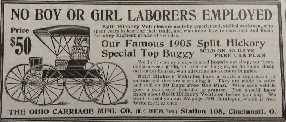
Ohio Carriage Company (1900s)
7up (1960s)
It’s funny to think that brands used to be able to make such bold claims like 7Up did in this ad. Apparently, if you drink their soda, you’ll suddenly get a burst of energy that will help you become a better bowler or ping pong player, in just 2-6 minutes! We’re also not sure what’s going on with the posing in this ad.
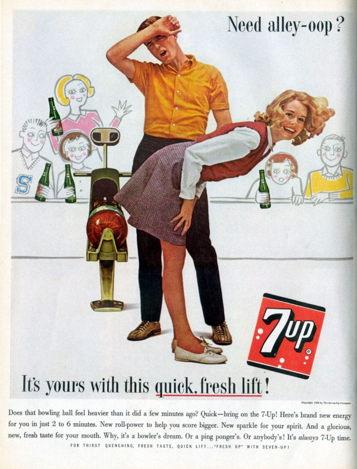
7up (1960s)
Marilyn Monroe Firework Safety Ad (1950s)
Although it’s not clear how Marilyn Monroe posing seductively in a swimsuit conveys anything about 4th of July firework safety, the one thing we’re pretty certain about is that this advertisement most likely caught people’s attention.
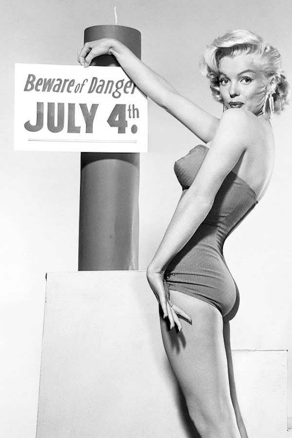
Marilyn Monroe Firework Safety Ad (1950s)
General Electric (1980s)
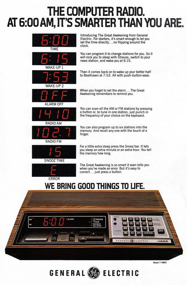
We take the “snooze” option for granted these days, but GE changed the game in the 1980’s by introducing the feature in its (then) high tech alarm clock. Of course, things have changed a lot since then as most of us use our phones as our alarm clocks, but we’re sure that a majority of us still use the “snooze” option.
General Electric (1980s)
Modern Hair Styling (1950s)
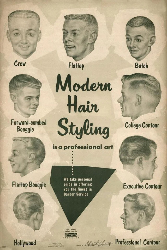
This is a pretty neat ad from the 1950’s that showcases what the modern hair styles were at the time for men. Some of these have come in and out of style throughout the decades and it is truly interesting to see how hairstyles evolve, change, and sometimes come back over time.
Modern Hair Styling (1950s)
Budweiser (1950s)
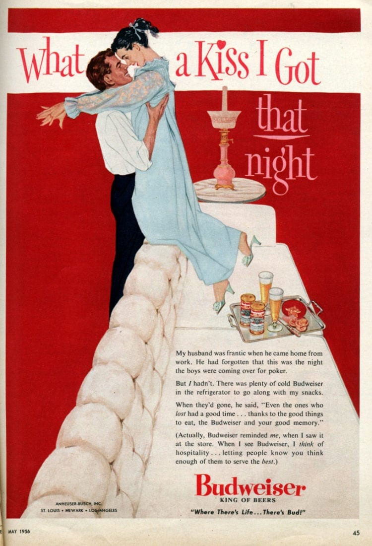
This 1950’s Budweiser advertisement is truly an interesting one. First off, it points out the fact that wives were not included in their husbands’ poker night with “the boys,” yet they were the ones expected to keep the house stocked with beer and snacks. Second, it’s interesting that the company could run an ad that took credit for the wife’s good memory.
Budweiser (1950s)
Hormel (1970s)
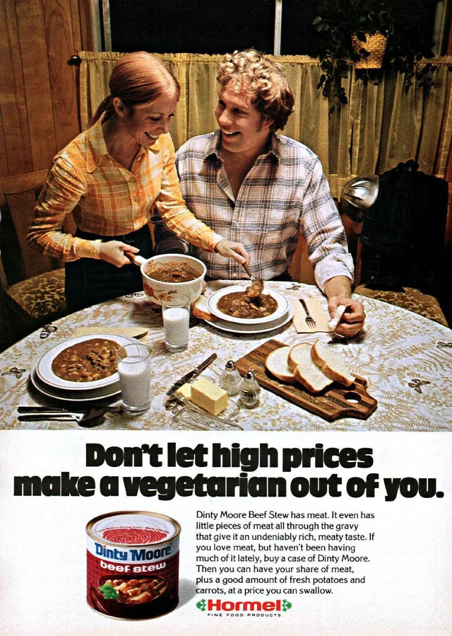
This Hormel ad from the 1970’s is a great example of how companies were marketing their products to fit the hard economic times of the decade. Hormel promised a meat-rich meal without a high price tag with their cans of Dinty Moore beef stew. To be honest, we think we actually prefer a meat free meal to this canned stuff, but who are we to judge.
Hormel (1970s)
Leggs (1970s)
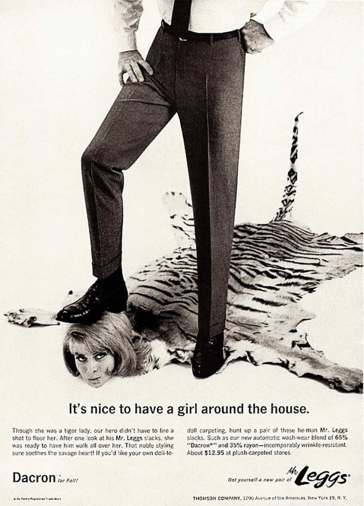
Some ads are sexist because times have changed, but some are just plain sexist. This ad is a perfect example of that, as it quite literally dehumanizes a woman and shows a man literally walking all over her, all because of a pair of pants. It’s pretty crazy that an ad like this was able to run. Luckily, something like this would not be able to run without immediately coming under fire
Leggs (1970s)
Nichols Industries Inc (1950s)
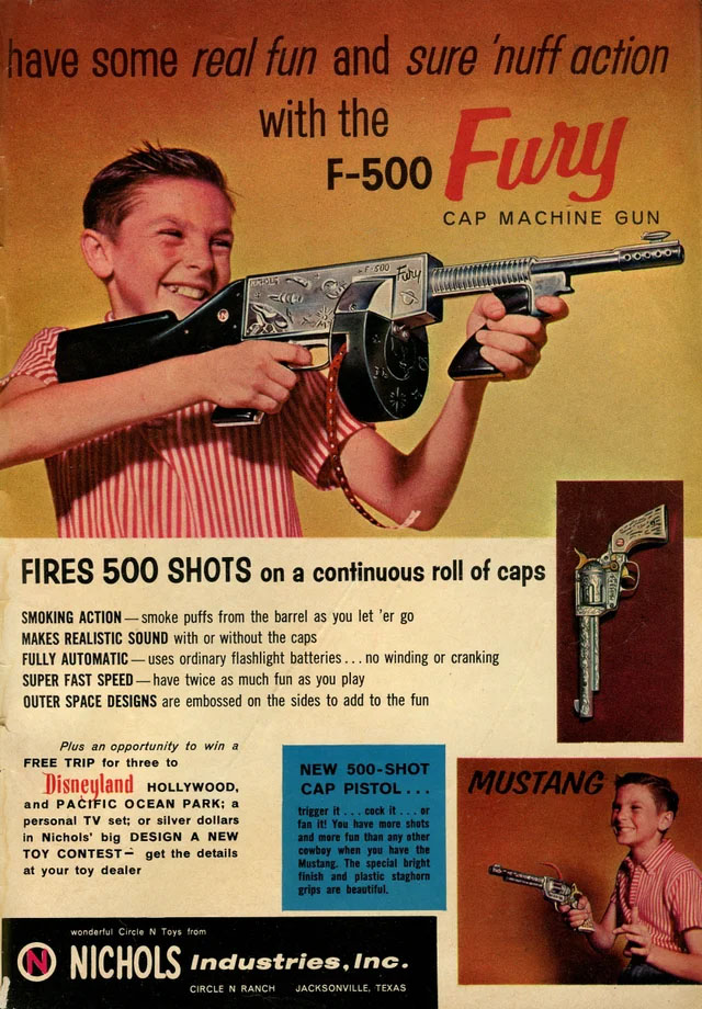
We’ve come a long way since the 1950’s, where a realistic gun was made as a children’s toy. The company even touts its “realistic sound” and other realistic features, whereas today, in the wake of so many tragic mass shootings, our society is trying to distance itself from having guns as children’s toys, even there is still plenty of work to do to reduce gun violence in America.
Nichols Industries Inc (1950s)
Kohler Bathroom Fixtures (1960s)
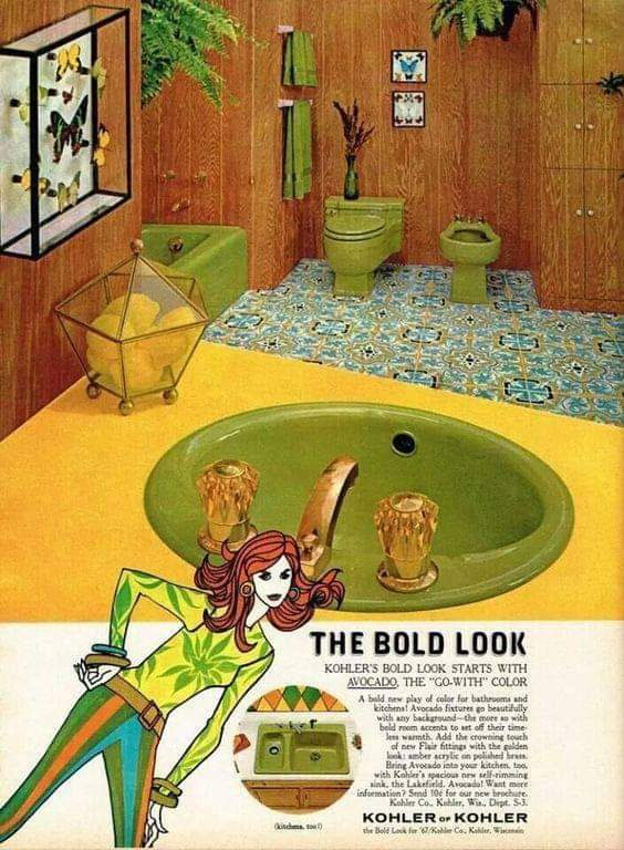
This bathroom really does scream out 1960’s aesthetic, which makes perfect sense since it is a 60’s Kohler ad. It’s funny to think that the company was advertising avocado colored bathroom appliances. We’re not sure how we feel about avocado colored toilets, but we don’t think this trend will make a comeback anytime soon. At least we hope not.
Kohler Bathroom Fixtures (1960s)
Airflow Company (1980s)
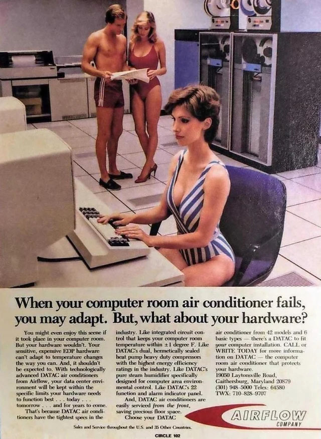
While this ad is eye-catching, we think that Airflow Company missed the mark here. Their argument is that although you might “enjoy this scene,” you can deal with a failed air conditioner system by adapting to its new hardware. If people are enjoying the scene, why would they want to change it? The whole thing is strange anyway, who wants to see their co-workers in their bathing suits? That’s seriously awkward.
Airflow Company (1980s)
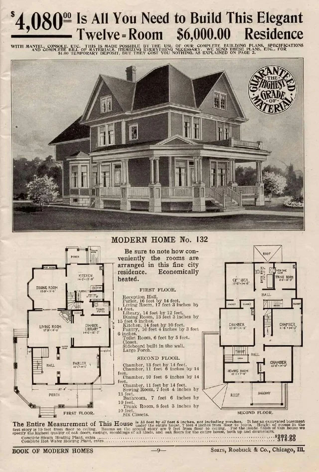
Sears (1910s)
Two things that are hard to believe in this ad: first, that Sears was in the house-selling game, and second, that a 12-bedroom home would only set you back $6000. With inflation, that makes it about $172,779 for a 12-bedroom house, which is still a bargain in truly every sense of the word. It’s unthinkable that such a home was available at that price.
Sears (1910s)
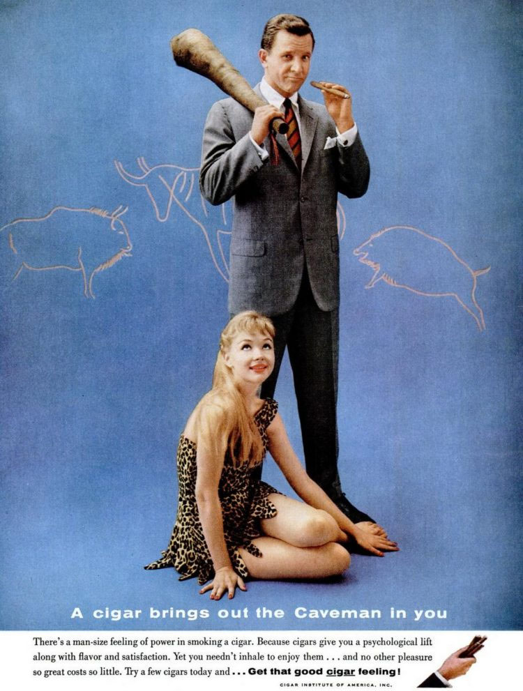
Cigar Institute Of America (1960s)
For some reason, in the 1960’s, it was a good idea to compare modern man to cavemen and pretend that it’s somehow a desirable effect. They somehow thought that convincing men that by smoking their cigars, they would become manlier. Of course, no caveman is complete without a subservient cavewoman.
Cigar Institute Of America (1960s)
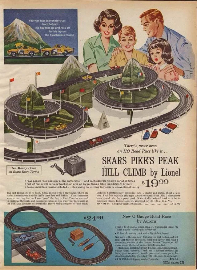
Sears Pikes Peak Hill Climb by Lionel (1960s)
There’s something really wholesome about this illustrated ad that showcases Sears’ Pikes Peak Hill Climb race car track toy. You can truly feel the wonder in the kids’ expression and we’ll say that although this dates back from the 1960’s, this set still looks really impressive.
Sears Pikes Peak Hill Climb By Lionel (1960s)
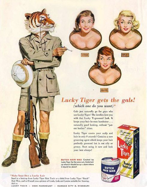
Lucky Tiger Hair Tonic (1950s)
Lucky Tiger Hair Tonic released this ad in the 1950’s that promised gentlemen their pick of the gals if they only use their product. We all know that that’s not really how things work, yet somehow this was the ad campaign that was run at the time. Luckily brands need to be a bit more creative nowadays.
Lucky Tiger Hair Tonic (1950s)
Tart-Chestnut Co (1930s)
Of course, while the name of this Tart-Chestnut product was not inappropriate at the time, this is an example of how word meanings can change and become less brand-friendly over time. “Big Tits” refers to the nickname of the Titus Tart chip company.
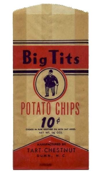
Tart Chestnut Co (1930s)
Sony (1960s)
Long before the days of smartphones, people had to lug around heavy equipment in order to record anything on video. In order to capture this bird’s nest, this guy had to climb up a tree with a video camera and a huge box that held the video tape. This certainly would not be an effective marketing campaign these days.
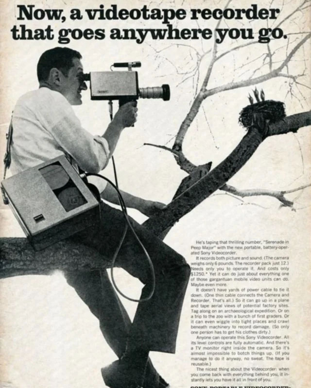
Sony (1960s)
Kelloggs (1930s)
In the 1930’s, Kelloggs took a stab at selling some vitamins. The way they decided to market them was by letting husbands know that these vitamins would keep their wives energetic despite doing all the housework and cooking, plus she’ll even look cuter while working harder! We’re glad things have moved away from this type of marketing.
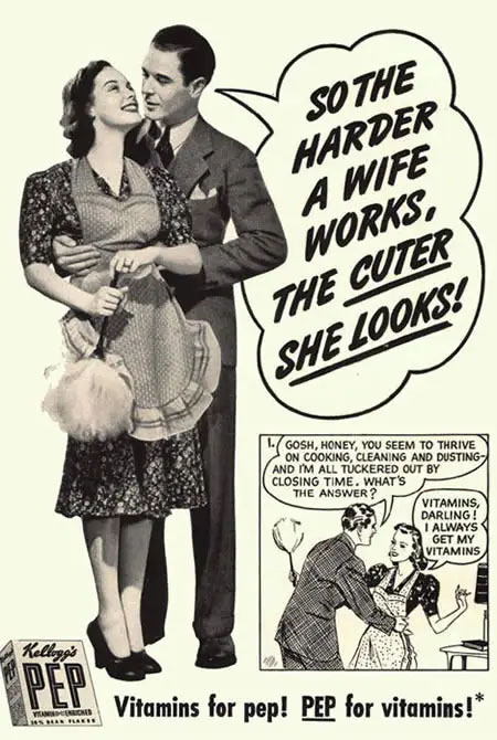
Kelloggs (1930s)
Toothache Drops (1885)
Back in 1885, not only was cocaine totally legal, it was even being advertised as a toothache drop that you could stop by your local pharmacy to purchase. There’s even an illustration of some kids on the cocaine ad. We now know that the side effects are quite dangerous.
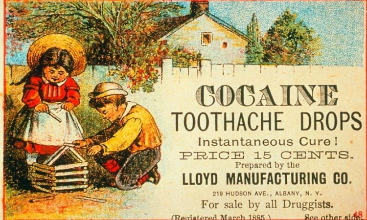
Toothache Drops (1885)
Camel (1940s)
It’s pretty hard to believe but in the 1940’s, Camel was able to release this ad promoting their cigarettes by letting potential buyers know that “more doctors smoke Camels than any other cigarette.” By today’s standard, not only would that not work, but we would probably not trust a doctor that promotes smoking cigarettes of any brand.
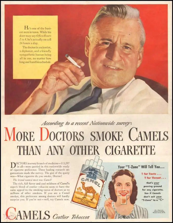
Camel (1940s)
Sony (1980s)
This Sony Walkman ad from the 1980’s perfectly captures the decade in one photo: from the portable cassette players, to the roller skates, to the clothing style, and the hairstyles. This is a nice and nostalgic look at what was considered cool in the 80’s.
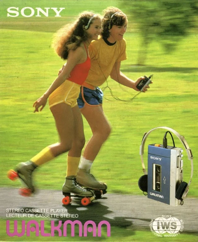
Sony (1980s)
Bell and Howell Projector (1950s)
Here’s another example of a 1950’s ad trying to promote a product through using women’s bodies and sex appeal. The main focus of the ad is clearly Sabrina’s chest, and it is not clear how this has anything to do with a color slide projector.
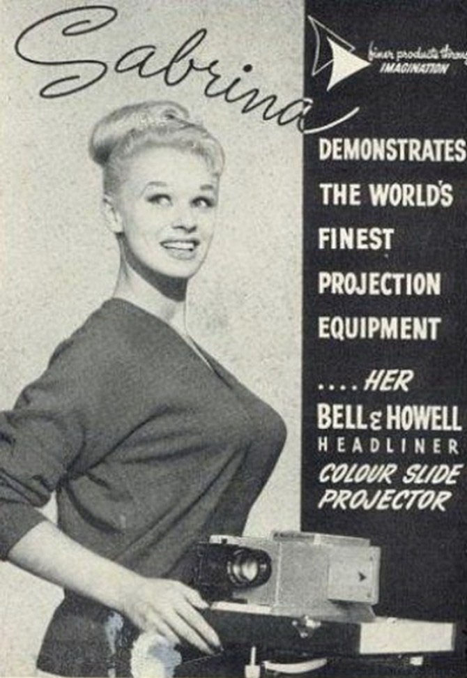
Bell And Howell Projector (1950s)
Plymouth (1940s)
A major difference between ads from today and ads from the 1940’s is the sheer amount of text that was included in this advertisement. We don’t think that anyone would have the patience to read through all this information in order to be convinced that this is the car to buy for them.
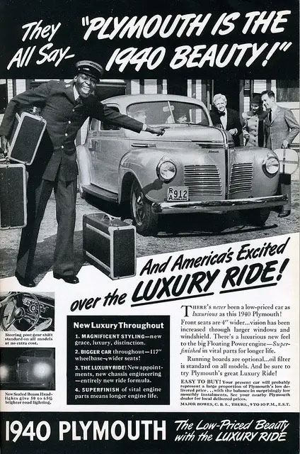
Plymouth (1940s)
Out Of The Closet Inc (1970s)
While we want to give this brand the benefit of the doubt that they were trying to normalize LGBTQ+ in those times, today this doll comes off as just plain offensive. “Gay Bob” the doll was marketed as the “world’s first gay doll for everyone,” which on the surface seems nice but when you really think about it, is pretty problematic.
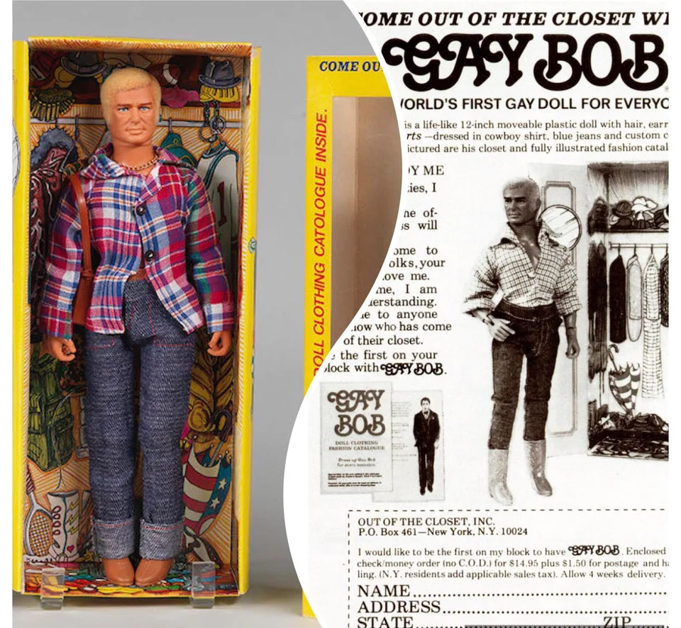
Out Of The Closet Inc (1970s)
Radio Shack (1970s)
In its heyday, Radio Shack was the go to one-stop-shop place in order to buy the latest and greatest when it came to anything technology related. Nowadays giants like Best Buy have totally crushed Radio Shack, which has declared bankruptcy more than once over the past few years.
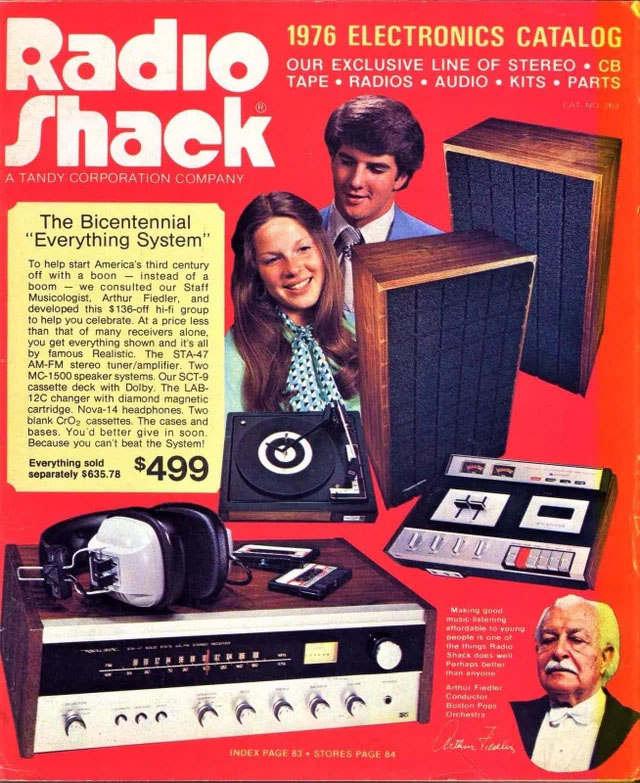
Radio Shack (1970s)
McDonalds (1970s)
While this could also be an attempt to be more inclusive for the 1970’s, these days, an advertisement that includes a whole lot of racial stereotypes like this would be considered absolutely unacceptable.
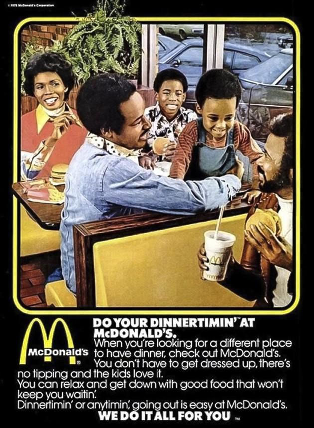
McDonalds (1970s)
Larsen Company (1949)
While there is nothing cultural offensive about this ad, it’s pretty unappealing to look at and is hard to believe that this was their best attempt to get people to buy 5 different types of veggies in 1 can. While that may have worked back then, most of us would not be into this idea these days.
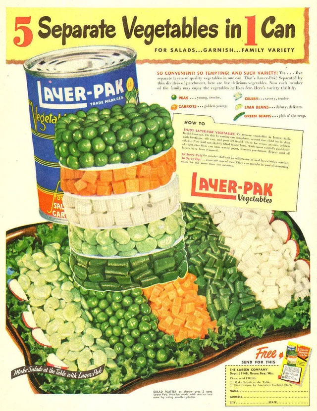
Larsen Company (1949)
Schlitz Beer (1950s)
Here’s another sexist 1950’s ad from Schlitz Beer. This time, we see a young wife upset because she has burnt dinner, with her husband “comforting” her that it’s okay because “at least she didn’t burn the Schlitz.”
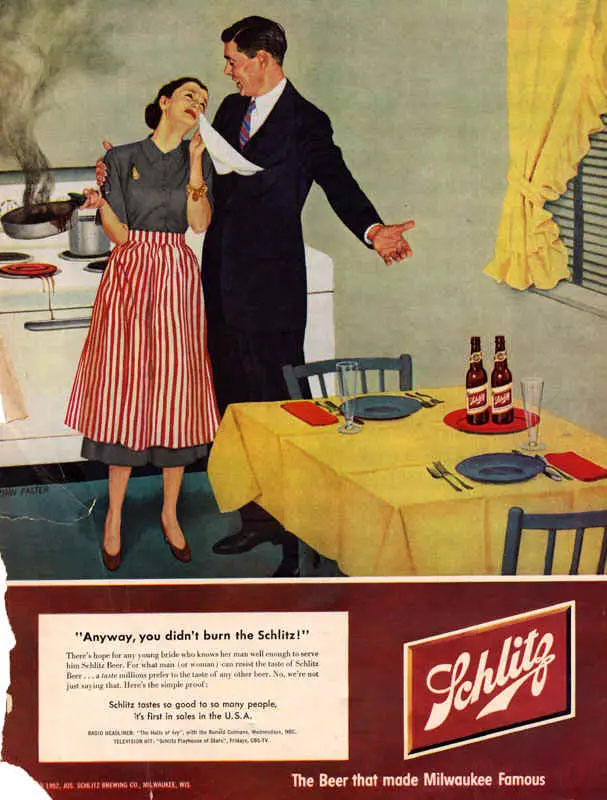
Schlitz Beer (1950s)
Western Electric (1950s)
It’s interesting to see what Western Electric thought the future would bring in terms of phones. They weren’t too far off with the design, but they couldn’t possibly think of the concept of a cordless phone back then in the 50’s. We wonder if the person who made this ad is alive today to see smartphones.
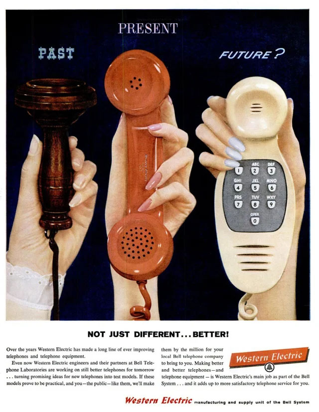
Western Electric (1950s)
Martini & Rossi (1960s)
Perhaps rivaling the woman being used as a rug is this ad for Martini & Rossi from the 1960’s that shows a woman literally trapped in a cage for a man’s enjoyment.
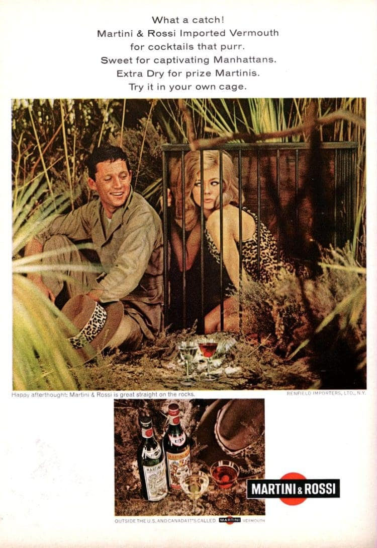
Martini & Rossi (1960s)
Honda (1970s)
It’s pretty unbelievable that this ad was ever approved, even if it did run in the 1970’s. We’re not even sure what they really mean by “a woman’s car,” but it really is ridiculous to market a vehicle based on gender. It’s pretty offensive that they were trying to equate a bad car to being “womanly.”
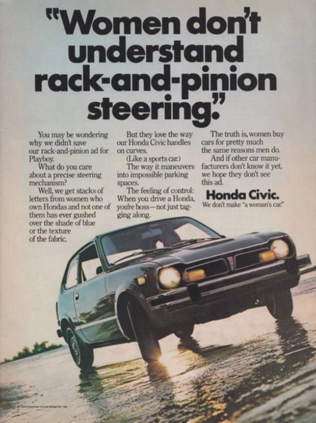
Honda (1970s)
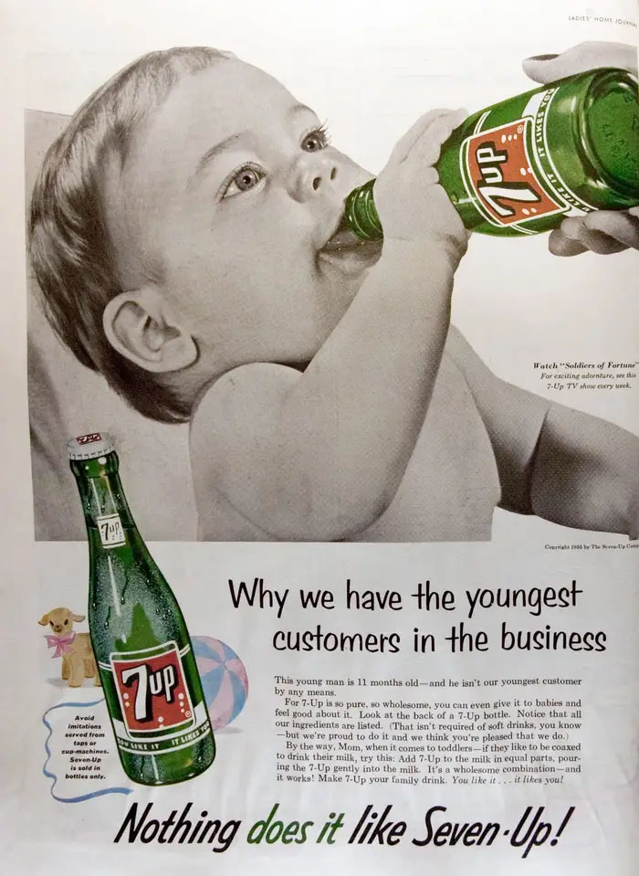
7up (1950s)
Here’s another one that absolutely could never run today. Here’s a casual 7Up advertisement showing a baby drinking a soda. Now, we know that a lot has changed since the 50’s but it really is wild to think that they would ever market a soda beverage by using a baby in the ad.
7up (1950s)
Texaco (1943)
This is a really interesting one. Here, Texaco is envisioning a world where children will ask who Hitler was, as at the time he was still very much alive and causing horrific genocide. This ad showed solidarity with the soldiers trying to help defeat Hitler and imagined a time where kids would not know who Hitler was and would have to ask their parents.

Texaco (1943)
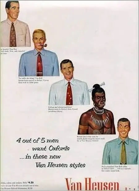
Van Heusen (1950s)
Like it or not, this Van Heusen ad is employing classist tropes in order to try to make their brand seem upper class and better than traditional tribal attire. This would absolutely never fly today.
Van Heusen (1950s)
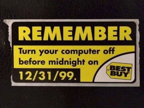
Best Buy (1999)
Ah, who can forget that craziness that was Y2k? Here’s a throwback ad from Blockbuster that reminds us of the panic that people went into on the evening of 12/31/1999 when they thought the whole world would implode.
Best Buy (1999)


